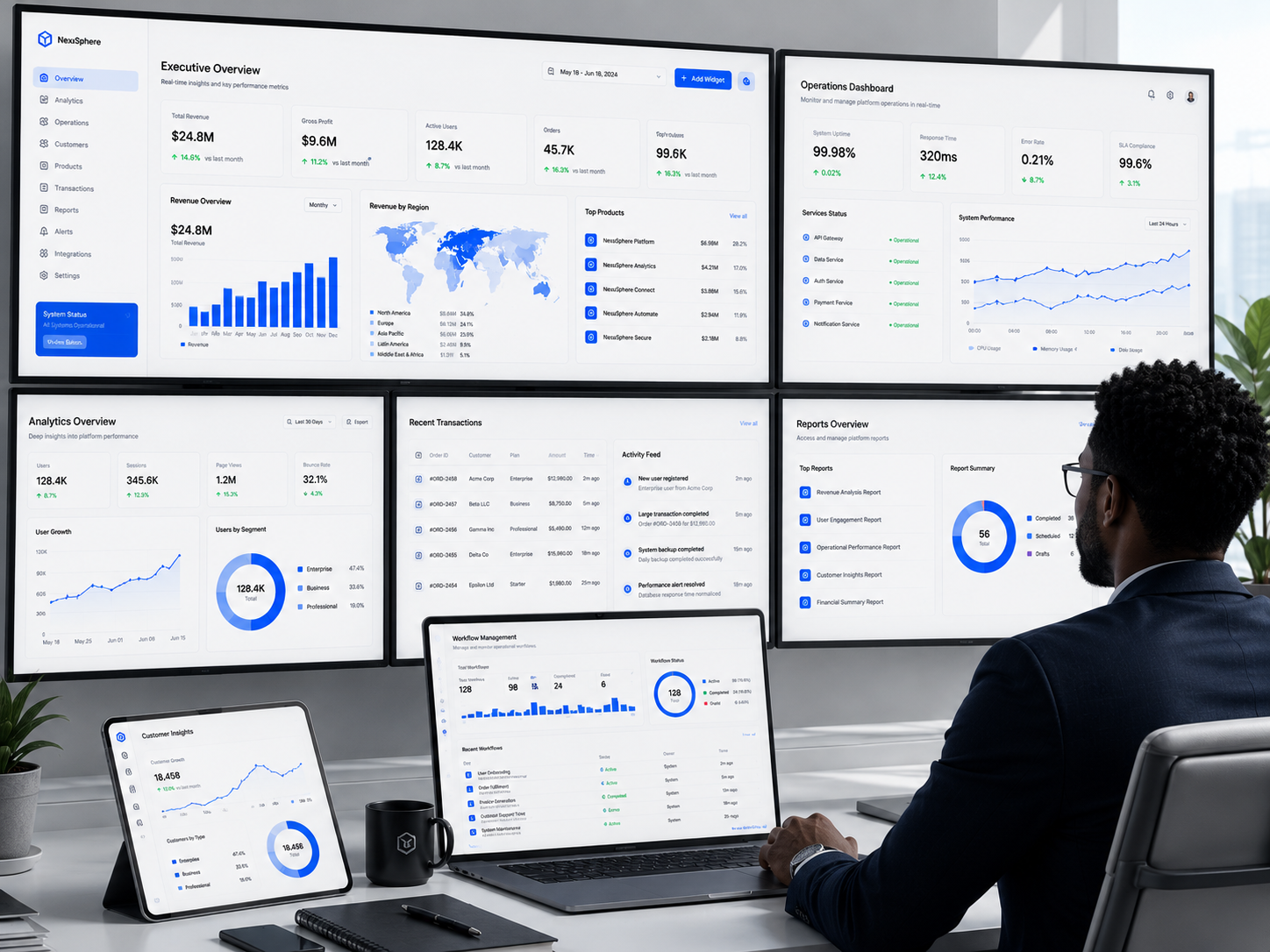
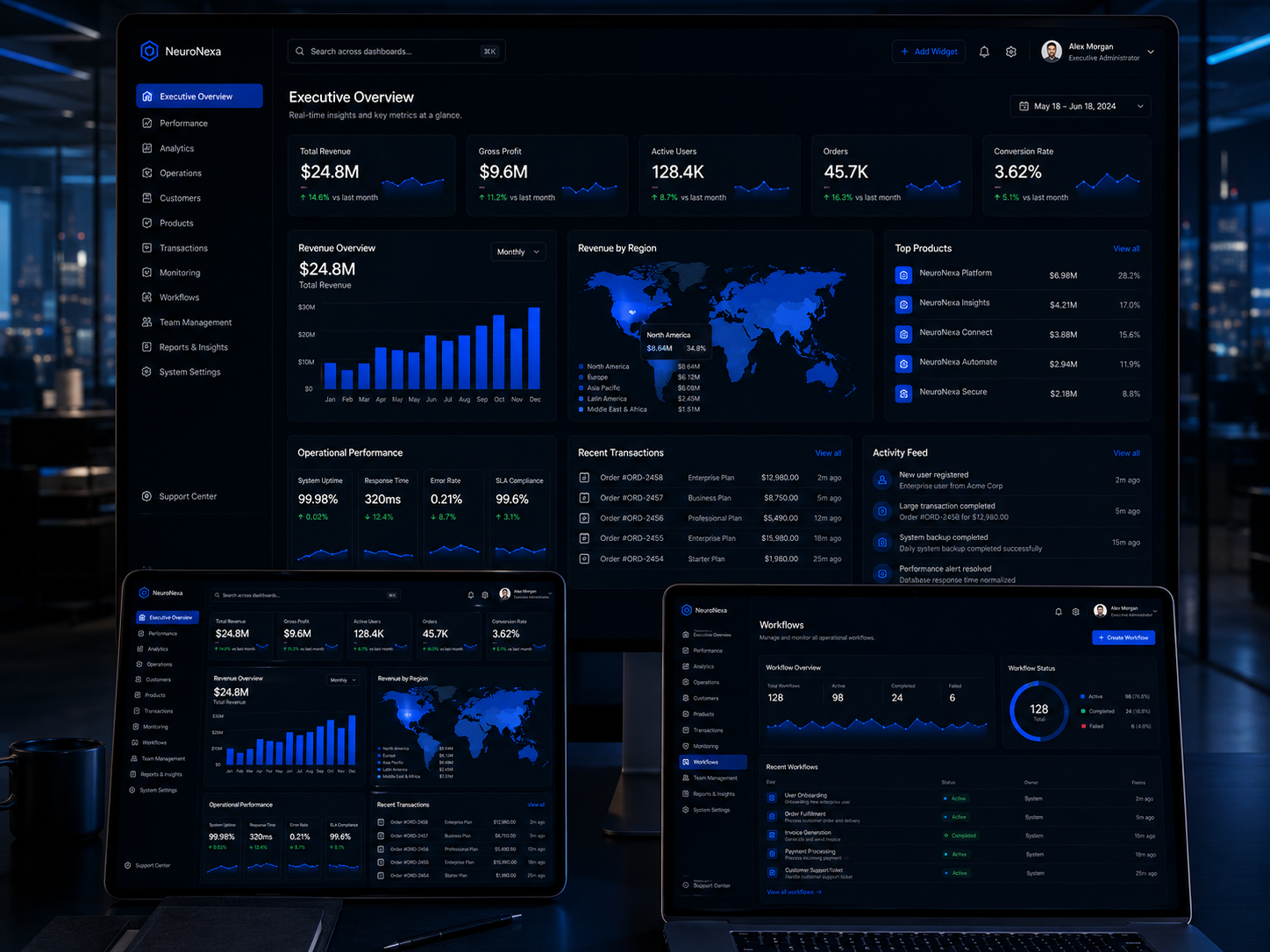
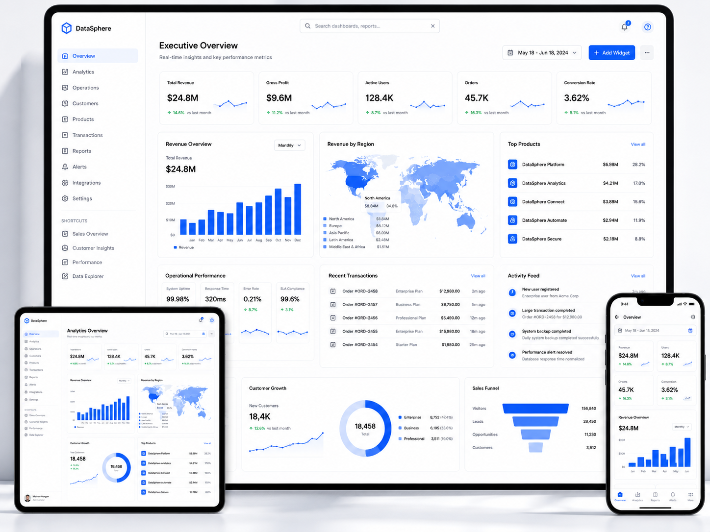
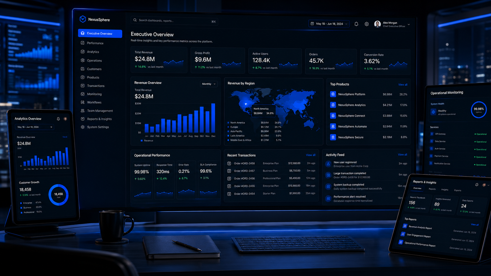
Cluttered, Confusing, and Slowing Down Your Operations
- Data without hierarchy or visual priority
- Frequent tasks buried behind multiple clicks
- Interface designed around database structure
- Key metrics scattered and trends invisible
Dashboard UI/UX designs the operational interfaces that power your business behind the scenes. Admin panels, analytics dashboards, data visualization screens, and internal tools that present complex information clearly, make frequent tasks efficient, and give your team the control they need without the frustration they have come to expect from enterprise software.
Dashboards and admin panels are where critical decisions are made. But most are designed as an afterthought. Data is dumped onto screens without hierarchy. Workflows require too many clicks. Important information is buried under irrelevant metrics. Your team develops workarounds because the official tools are too frustrating. A properly designed dashboard surfaces the right data at the right time, makes common tasks fast and intuitive, and turns operational tools from a source of friction into a competitive advantage.
Every metric gets equal visual weight. Your team cannot distinguish what matters from what is noise. Critical alerts look the same as routine status updates. Users waste mental energy filtering information that should have been designed with priority.
Actions your team performs dozens of times a day are buried in menus or spread across multiple screens. What should take one click takes five. Efficiency is sacrificed because nobody designed the workflow from the user's perspective.
Your admin panel exposes database structures instead of user tasks. Field names match code instead of concepts your operations team understands. The interface assumes technical knowledge your actual users do not have.
Key metrics are scattered across disconnected screens. Trends are invisible because data is presented as tables instead of visualizations. Your team reacts to problems after they escalate because the dashboard never surfaced the early warning signs.
Dashboard UI/UX designs the internal tools your team depends on every day. We turn complex data into clear visual hierarchies. We streamline frequent workflows into efficient actions. We design interfaces that match how your team thinks and works, not how your database is structured. The result is an operational tool your team actually wants to open.
Your team understands the state of the business at a glance because data is presented with clear visual priority.
Frequent tasks are optimized for speed. What took minutes now takes seconds.
Clear interfaces with proper confirmation flows prevent the mistakes that happen when users are confused.
Alerts, trends, and visualizations surface problems before they escalate, not after.
Complete dashboard and admin interface design with every screen, data visualization, workflow, and operational tool your team needs.
The command center screen that tells your team the state of the business at a glance.
Every chart and data display designed so trends and insights are immediately visible.
Every operational interface your team needs to manage the business day to day.
Frequent tasks streamlined so your team works faster with fewer clicks and less frustration.
Your team sees what needs attention immediately, not after the problem has grown.
Tools for generating insights and reports without needing a data analyst to interpret them.
Platform controls organized so your team finds what they need without hunting through menus.
A component library that keeps your operational interfaces consistent as new features are added.
A user-task-first design methodology that builds operational interfaces around what your team actually needs to accomplish, not what your database happens to store.
We study how your operations team actually works to understand their tasks, pain points, and the information they need to make decisions.
Conversations with the people who use the dashboard daily to understand their roles, responsibilities, and frustrations with current tools.
Documenting every task the dashboard must support, how often each task is performed, and the current number of steps required.
Identifying every data point, metric, and alert the team needs, organized by role, priority, and decision context.
Defining the complete feature set organized by user role with clear access levels and permission requirements.
We design the structural foundation of the dashboard organizing screens, navigation, and data so users find what they need intuitively.
Organizing all dashboard screens into a logical navigation structure that matches how users think about their work.
Defining what information appears on each screen and in what order of visual priority based on user task importance.
Structural layouts for all core screens establishing content placement, data priority, and navigation logic before visual design.
Documenting how users move between screens to complete multi-step tasks and ensuring the navigation supports those journeys.
We design how data is presented across the dashboard so trends are visible, comparisons are clear, and insights emerge without analysis effort.
Selecting the appropriate visualization for each data type and designing every chart for clarity, readability, and insight.
Designing data tables with proper column hierarchy, sorting, filtering, pagination, and row actions for efficient data management.
Designing metric displays that show current values, trends, comparisons, and thresholds with clear visual status indicators.
Establishing the visual style for all data displays including color coding for status, trend direction, and alert severity.
We design every screen and workflow at high fidelity optimizing for the speed, clarity, and efficiency your operations team needs.
Designing every dashboard screen at high fidelity with all data displays, controls, and states fully realized.
Designing efficient interfaces for frequent tasks including inline editing, bulk selection, keyboard shortcuts, and quick action menus.
Designing powerful search and filtering interfaces that help users find specific records, transactions, or users quickly.
Designing every state for every screen: empty, loading, error, no results, and confirmation states across all dashboard interfaces.
We test the dashboard designs with real users to validate that the interfaces support their tasks efficiently and identify any friction before development.
Building a clickable prototype of the dashboard that simulates real workflows for testing with operations team members.
Testing with actual dashboard users performing their real tasks to measure efficiency and identify confusion points.
Comparing task completion times and click counts against the current system or baselines to quantify the improvement.
Adjusting screens and workflows based on validated user feedback to resolve any remaining friction before development.
We deliver the complete dashboard design with a reusable component library and full developer specifications for efficient implementation.
Complete set of reusable dashboard components including charts, tables, forms, filters, and navigation elements with usage documentation.
Detailed specifications for every screen including measurements, data display rules, interaction behavior, and responsive adaptations.
Comprehensive sessions with your engineering team covering the dashboard architecture, component library, and implementation approach.
Design support throughout development including design QA, implementation reviews, and guidance to ensure the built dashboard matches the design intent.
Workdone: A unified brand and digital foundation for a multi-subsidiary Pan-African financial group building institutional credibility across emerging African markets.
Workdone: A complete brand and business foundation preparing a cleaning startup for market entry and investment readiness.
Validate your product idea with real users before investing in development. Stop building on assumptions.
Get Started Free Get Started Free
Get complete interface design for a launch-ready minimum viable product your developers can build immediately.
Get Started Free Get Started Free
End-to-end product design covering every screen, state, user type, and platform for a product ready to scale.
Get Started Free Get Started Free
Multi-sided platform design for marketplaces connecting buyers, sellers, and administrators with balanced experiences.
Get Started Free Get Started FreeTry adjusting your search term.
Your team runs your business from behind these screens. Design dashboards that surface what matters, streamline what is frequent, and make operational control feel effortless. Stop forcing your team to fight their tools and start giving them interfaces that make their work faster, clearer, and better.
Get Started Free Get Started Free